

Build a Time Tracking Dashboard using Angular and Tailwind CSS

I'm a full stack web/mobile developer and content creator
Overview
In this tutorial I show you my step by step process to complete a challenge from Frontend Mentor. We will create a responsive Time Tracking Dashboard with Angular and Tailwind CSS.
Prerequisites
- Angular CLI
- Basic knowledge of Angular
- A free account from frontendmentor.io (in order to download the challenge assets)
Workspace setup
Creating a new workspace
Start by creating a new workspace with Angular CLI. Open a terminal in the directory you want to generate your project and enter the following command:
ng new time-tracking-dashboard
You then receive the following prompts in your command line:
Would you like to add Angular routing?:     n
Wich stylesheet format would you like to use?:     SCSS
After that, needed packages will be dowloaded and a folder time-tracking-dashboard will be created in your directory. Open that folder in your IDE - I use VSCode.
Copying assets
Copy images folder and data.json file from the assets downloaded from frontendmentor.io and paste them in your Angular project assets directory, src/assets:
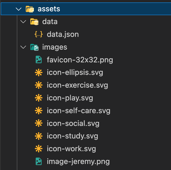 Figure 1: Assets folder
Installing Tailwind CSS
Inside your Angular project, run the following npm command:
npm install -D tailwindcss postcss autoprefixer
Then generate a tailwind.config.js file with the following command:
npx tailwindcss init
Inside the tailwind.config.js file, make sure the content looks like the following:
/** @type {import('tailwindcss').Config} */
module.exports = {
  content: [
    "./src/**/*.{html,ts}", // <== update
  ],
  theme: {
    extend: {},
  },
  plugins: [],
}
Now copy the following lines inside src/styles.scss:
@tailwind base;
@tailwind components;
@tailwind utilities;
Let’s see if our Tailwind CSS setup works. Replace the content of src/app/app.component.html by the following:
<h1 class="text-3xl text-blue-500 capitalize ">
  time tracking dashboard
</h1>
Then use the following command to start your Angular project and open it in your browser:
ng serve --o
You should have the following screen:
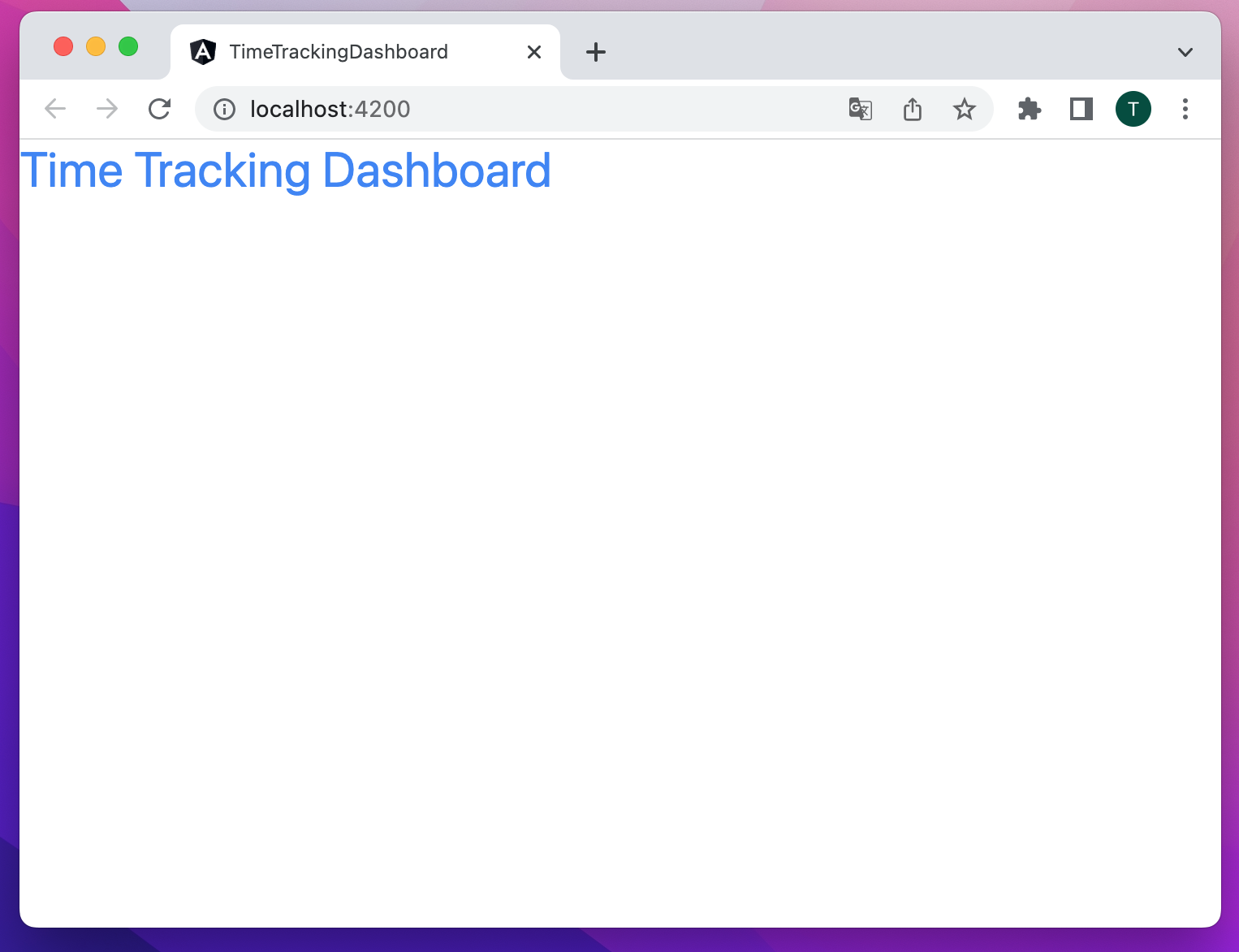 Figure 2: Tailwind CSS setup test
Setting up fonts
Let’s go to Google Fonts first to get fonts we need. Then type Rubik in the search bar and choose the first font.
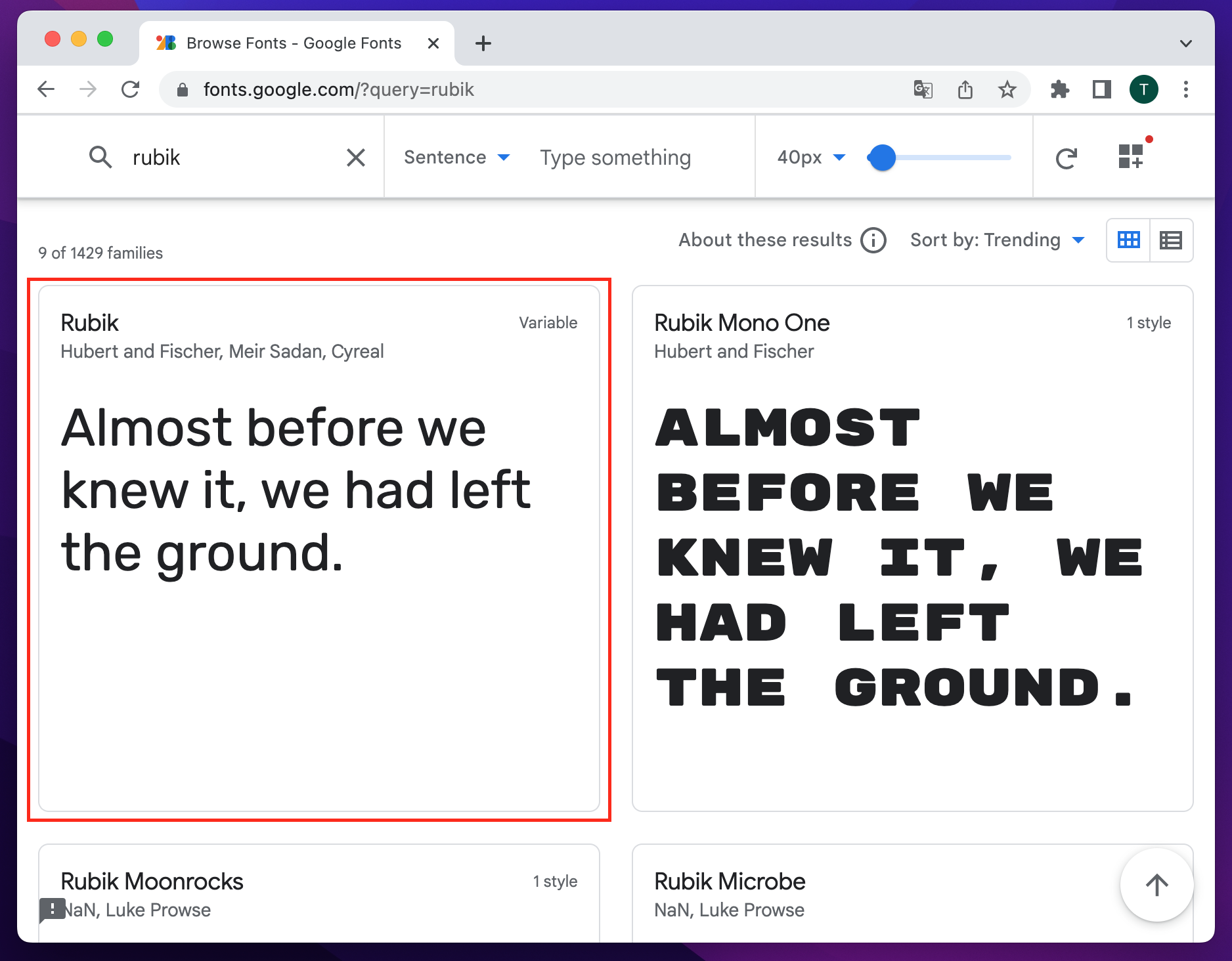 Figure 3: Rubik font search
On the Rubik styles page, select the following:
- Light 300
- Regular 400
- Medium 500
Then click on the last element on right in the navigation bar to display a new menu. When the lateral menu opens, choose @import then copy the content between style tag.
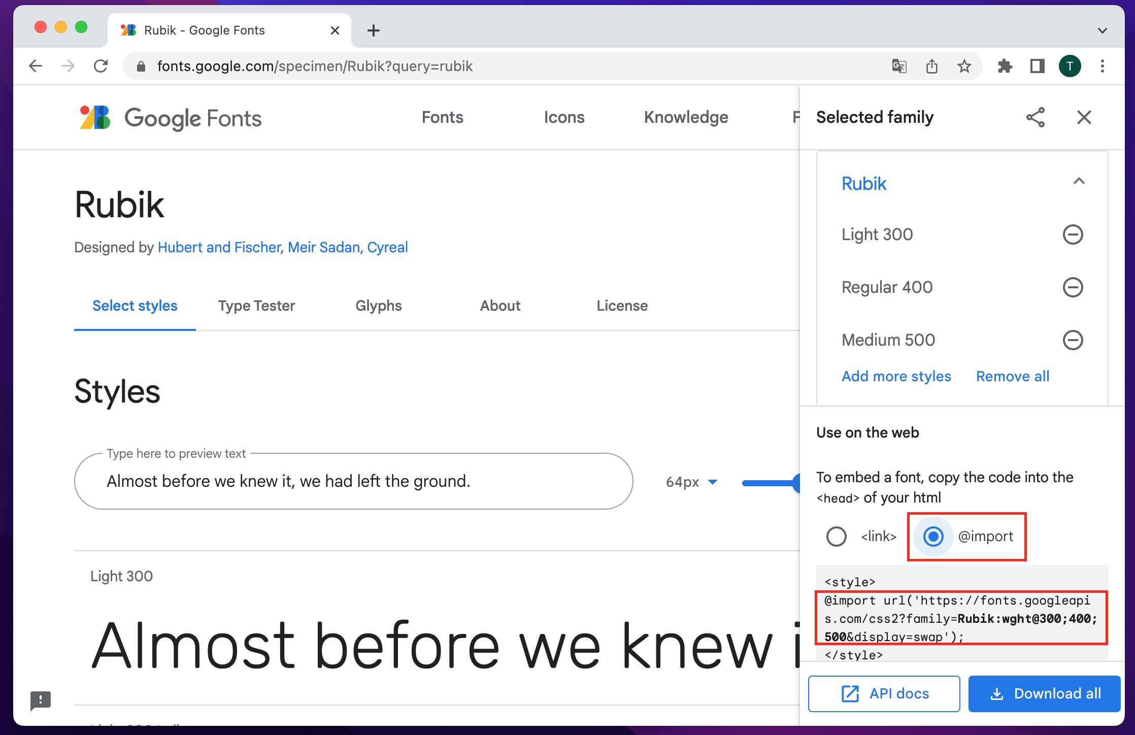 Figure 4: Rubik styles page
Now get back to the Angular project in src/styles.scss file and paste the code you copied from Google Fonts. That file will now look like the following:
/* You can add global styles to this file, and also import other style files */
@tailwind base;
@tailwind components;
@tailwind utilities;

// update
@import url('https://fonts.googleapis.com/css2?family=Rubik:wght@300;400;500&display=swap');
Next, go to tailwind.config.js file at the root of the project to configure the default font that will be used. The content of that file should look like the following:
/** @type {import('tailwindcss').Config} */

module.exports = {
  content: ["./src/**/*.{html,ts}"],
  theme: {
    extend: {
      fontFamily: { // <== update
        "sans": ["Rubik", "sans-serif"],
      },
    },
  },
  plugins: [],
};
We are now able to use font-light, font-regular or font-medium class to give light, regular or medium weight to the texts.
Let’s also configure the font sizes we are going to use. The tailwind.config.js file should now look like the following:
/** @type {import('tailwindcss').Config} */

module.exports = {
  content: ["./src/**/*.{html,ts}"],
  theme: {
    extend: {
      fontFamily: {
        "sans": ["Rubik", "sans-serif"],
      },
      fontSize: { // <== update
        "tiny": "15px",
        "base": "18px",
        "lg": "24px",
        "xl": "32px",
        "2xl": "40px",
        "3xl": "56px",
      },
    },
  },
  plugins: [],
};
Setting up color palette
Let’s define the color palette in the tailwind.config.js file. The file should look like the following now:
/** @type {import('tailwindcss').Config} */

module.exports = {
  content: ["./src/**/*.{html,ts}"],
  theme: {
    extend: {
      fontFamily: {
        "sans": ["Rubik", "sans-serif"],
      },
      fontSize: {
        "tiny": "15px",
        "base": "18px",
        "lg": "24px",
        "xl": "32px",
        "2xl": "40px",
        "3xl": "56px",
      },
      colors: { // <== update
        "blue": "#5847EB",
        "desaturated-red": "#FF8C66",
        "soft-blue": "#56C2E6",
        "light-red": "#FF5C7C",
        "lime-green": "#4ACF81",
        "violet": "#7536D3",
        "soft-orange": "#F1C65B",
        "very-dark-blue": "#0F1424",
        "dark-blue": "#1C1F4A",
        "desaturated-blue": "#6F76C8",
        "pale-blue": "#BDC1FF",
        "hover-blue": "#34397B"
      }
    },
  },
  plugins: [],
};
Setting up spacings
Let’s define the spacing values in the tailwind.config.js file. The file should look like the following now:
/** @type {import('tailwindcss').Config} */

module.exports = {
  content: ["./src/**/*.{html,ts}"],
  theme: {
    extend: {
      fontFamily: {
        "sans": ["Rubik", "sans-serif"],
      },
      fontSize: {
        "tiny": "15px",
        "base": "18px",
        "lg": "24px",
        "xl": "32px",
        "2xl": "40px",
        "3xl": "56px",
      },
      colors: {
        "blue": "#5847EB",
        "desaturated-red": "#FF8C66",
        "soft-blue": "#56C2E6",
        "Light-red": "#FF5C7C",
        "lime-green": "#4ACF81",
        "violet": "#7536D3",
        "soft-orange": "#F1C65B",
        "very-dark-blue": "#0F1424",
        "dark-blue": "#1C1F4A",
        "desaturated-blue": "#6F76C8",
        "pale-blue": "#BDC1FF",
                "hover-blue": "#34397B"
      },
      spacing: { // <== update
        "1": "8px",
        "2": "18px",
        "3": "24px",
        "4": "28px",
        "5": "32px",
        "6": "38px",
        "7": "40px",
        "8": "68px",
        "9": "74px",
        "10": "80px",
        "11": "256px",
        "12": "324px"
      }
    },
  },
  plugins: [],
};
Mobile design implementation
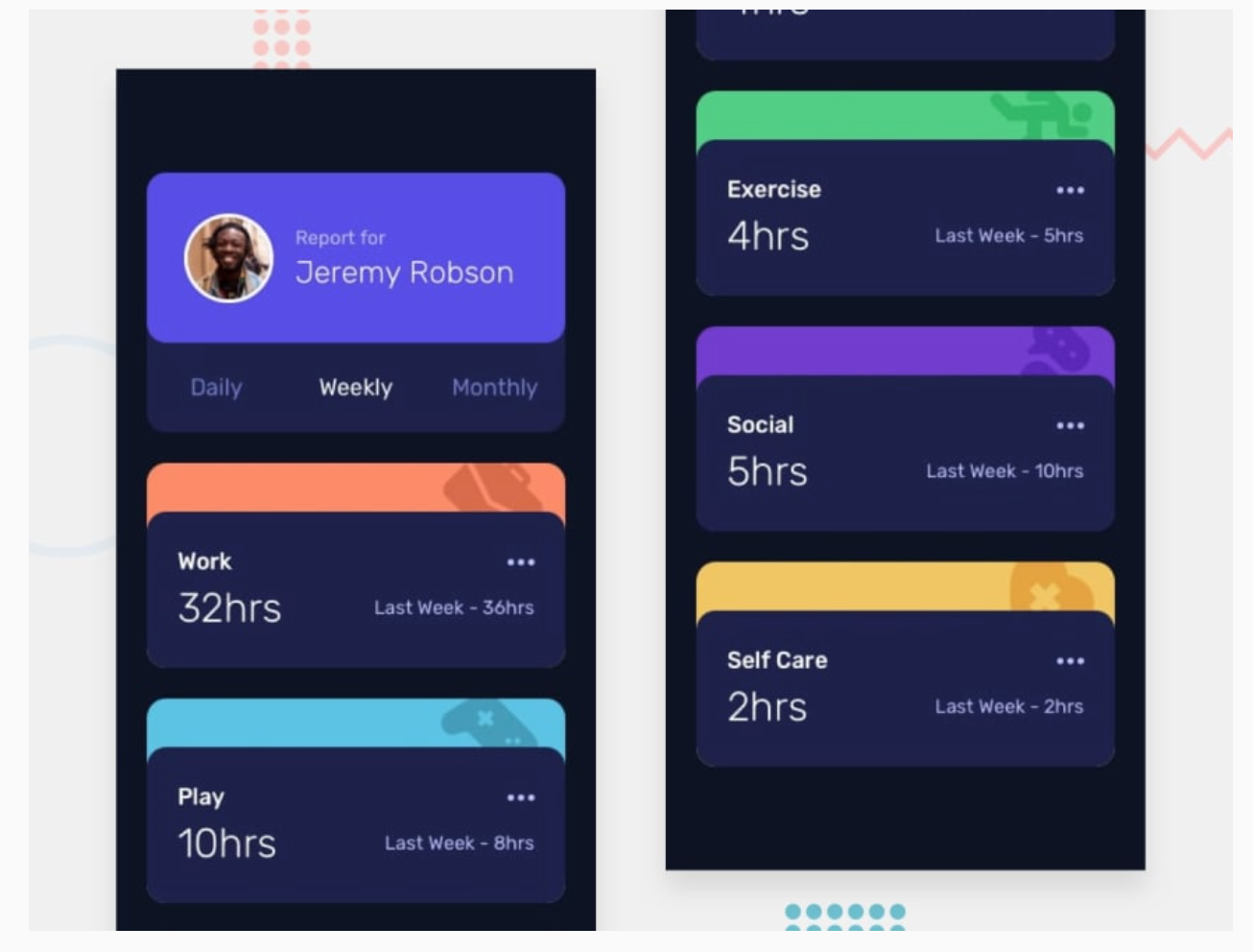 Figure 5: Time Tracking Dashboard mobile design
The image above represents the mobile interface. It can be broken in three parts as shown in the image below:
- A main container (the blue arrow)
- A report component (the red arrow)
- Multiple activity components (yellow arrows)
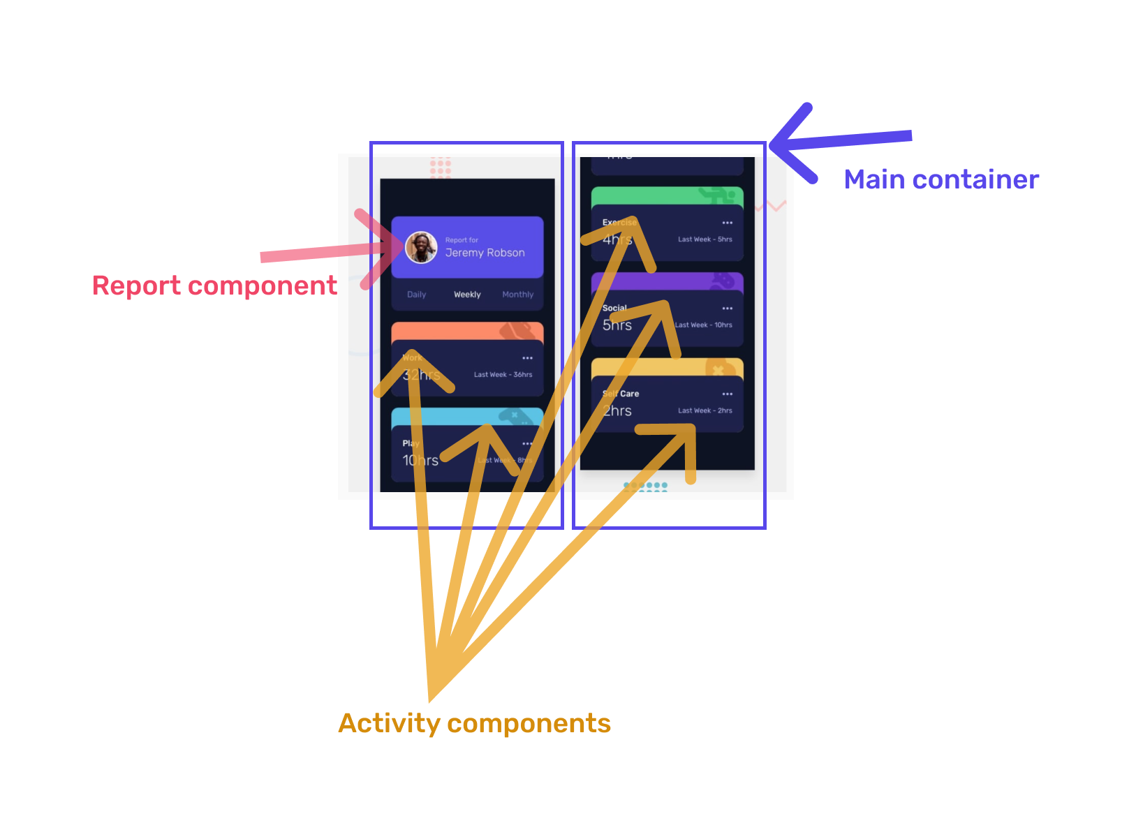 Figure 6: Mobile design decomposition
Main container
Let’s start with the Main container. First, open src/index.html and update body as the following:
<!doctype html>
<html lang="en">
<head>
  <meta charset="utf-8">
  <title>TimeTrackingDashboard</title>
  <base href="/">
  <meta name="viewport" content="width=device-width, initial-scale=1">
  <link rel="icon" type="image/x-icon" href="favicon.ico">
</head>

<body class="grid items-center justify-center min-h-screen text-base bg-very-dark-blue text-pale-blue">
  <app-root></app-root>
</body>
</html>
Then open src/app/app.component.html file and replace its content by the following:
<!-- main container -->
<main class="grid grid-cols-1 gap-3 px-3 py-10">

</main>
The following image shows the result we get in the browser when we preview the mobile version of the app:
 Figure 7: Main container preview
Report component
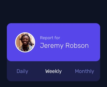 Figure 8: Report component
Now, using the Angular CLI generate the report component with the following command:
ng generate component report
The previous command will create all necessary component files inside the src/app/report folder:
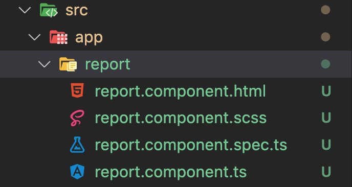 Figure 9: Report component folder
Now let’s import that component in the main container. This is done by adding app-report tag inside the src/app/app.component.html file. This file should now look like the following:
<!-- main container -->
<main class="grid grid-cols-1 gap-3 px-3 py-10">

    <!-- report component -->
    <app-report></app-report>
</main>
Next let’s break down the report component into several blocks. The following image shows the decomposition of the report component:
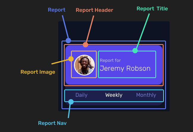 Figure 10: Report component decomposition
Report and Report Nav blocks
In the src/app/report/report.component.ts file add two variables:
- periods: It contains an array of periods
- activePeriod: It indicates the selected period
Also add a method to change activePeriod variable each time a period is selected. This method will be called setActivePeriod. The src/app/report/report.component.ts should look like the following:
import { Component, OnInit } from '@angular/core';

@Component({
  selector: 'app-report',
  templateUrl: './report.component.html',
  styleUrls: ['./report.component.scss']
})
export class ReportComponent implements OnInit {

  // update
  periods: string[] = ["Daily", "Weekly", "Monthly"];
  activePeriod: string = "Daily";

  constructor() { }

  ngOnInit(): void {
  }

  // update
  setActivePeriod(period: string): void {
    this.activePeriod = period;
  }

}
Then open the src/app/report/report.component.html file and replace its content with the following:
<!-- Report -->
<div class="bg-dark-blue rounded-2xl">

  <!-- Report Nav -->
  <div class="flex justify-between px-4 py-3 text-desaturated-blue">
    <span
      *ngFor="let period of periods"
      (click)="setActivePeriod(period)"
      [ngClass]="{'text-white': activePeriod === period}"
    >{{ period }}</span>
  </div>
</div>
If we preview the application now it should look like the following:
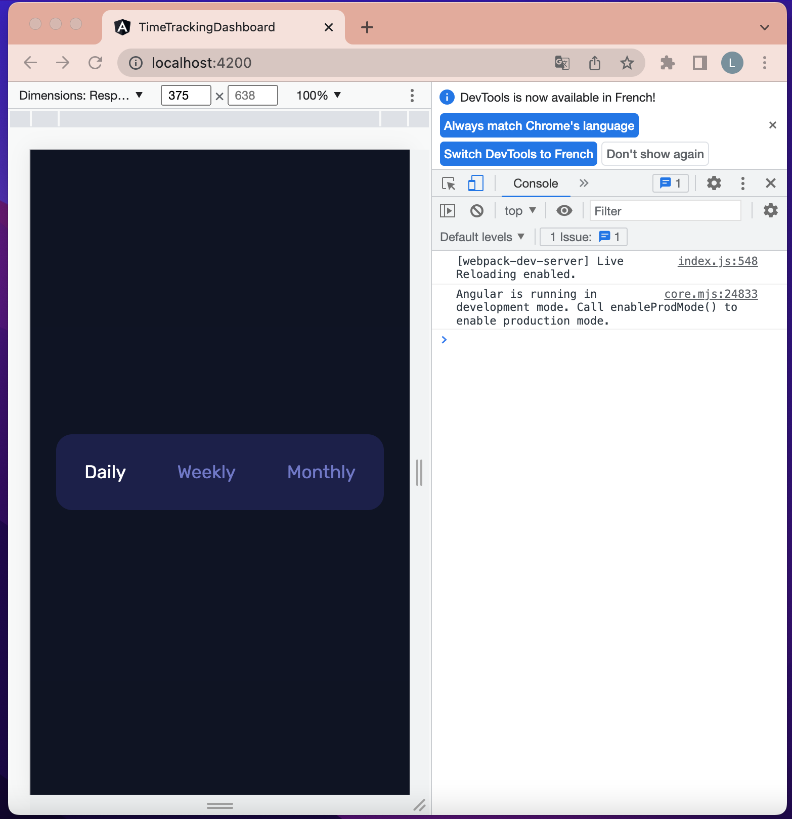 Figure 11: Report component - Report and nav blocks
Update src/app/report/report.component.html file content to be the same as the following:
<!-- Report -->
<div class="w-12 bg-dark-blue rounded-2xl">

  <!-- Report Header -->
  <div class="flex items-center px-4 bg-blue py-5 rounded-2xl">

    <!-- Report Image -->
    <div class="border-2 border-white rounded-full w-9 mr-2">
      <img src="/assets/images/image-jeremy.png" alt="user profile picture" />
    </div>

    <!-- Report Title -->
    <h1 class="text-tiny">
      Report for <br>
      <span class="text-lg font-light text-white">
        Jeremy Robson
      </span>
    </h1>
  </div>

  <!-- Report Nav -->
  <div class="flex justify-between px-4 py-3 text-desaturated-blue">
    <span
      *ngFor="let period of periods"
      (click)="setActivePeriod(period)"
      [ngClass]="{'text-white': activePeriod === period}"
    >{{ period }}</span>
  </div>
</div>
Previewing the application should now look like the following:
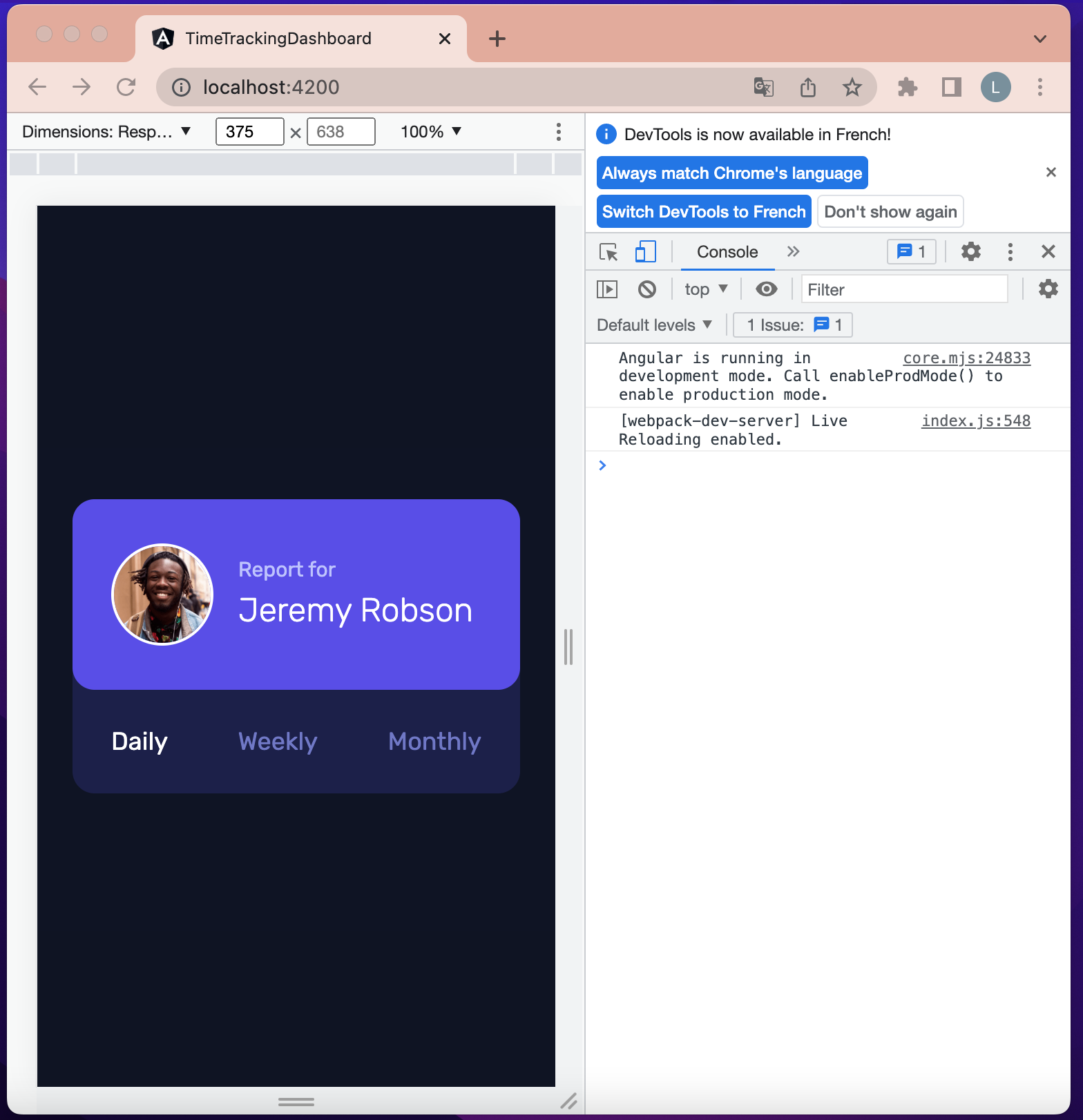 Figure 12: Report component - header, image and title blocks
Activity components
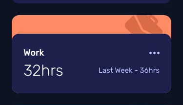 Figure 13: Activity component
Generate the activity component with the following command:
ng generate component activity
The previous command will create all necessary component files inside the src/app/activity folder:
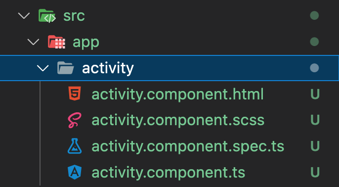 Figure 14: Activity component folder
A JSON file that contains the activities is located in src/assets/data folder. We will create a model that follows the architecture of an activity object and then we will generate a service to call these activities.
In src/app/activity folder, create a new file named activity.model.ts and make sure its content is the same as the following:
export interface IActivity {
  title: string;
  timeframes: ITimeframe;
}

export interface ITimeframe {
  daily: ITimeframeDetail;
  weekly: ITimeframeDetail;
  monthly: ITimeframeDetail;
}

export interface ITimeframeDetail {
  current: number;
  previous: number;
}
Next, create inside src/app/activity folder, a new file named mock-activities.ts . The following image shows the content of src/app/activity folder:
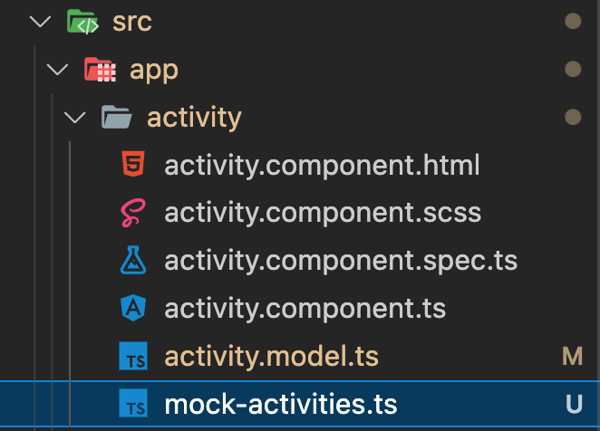 Figure 15: Activity component folder - mock-activities
Then copy the content of src/assets/data/data.json in src/app/activity/mock-activities.ts file and declare a variable to export it. The content of src/app/activity/mock-activities.ts should now look like the following:
import { IActivity } from './activity.model';

export const ACTIVITIES: IActivity[] = [
  {
    "title": "Work",
    "timeframes": {
      "daily": {
        "current": 5,
        "previous": 7
      },
      "weekly": {
        "current": 32,
        "previous": 36
      },
      "monthly": {
        "current": 103,
        "previous": 128
      }
    }
  },
  {
    "title": "Play",
    "timeframes": {
      "daily": {
        "current": 1,
        "previous": 2
      },
      "weekly": {
        "current": 10,
        "previous": 8
      },
      "monthly": {
        "current": 23,
        "previous": 29
      }
    }
  },
  {
    "title": "Study",
    "timeframes": {
      "daily": {
        "current": 0,
        "previous": 1
      },
      "weekly": {
        "current": 4,
        "previous": 7
      },
      "monthly": {
        "current": 13,
        "previous": 19
      }
    }
  },
  {
    "title": "Exercise",
    "timeframes": {
      "daily": {
        "current": 1,
        "previous": 1
      },
      "weekly": {
        "current": 4,
        "previous": 5
      },
      "monthly": {
        "current": 11,
        "previous": 18
      }
    }
  },
  {
    "title": "Social",
    "timeframes": {
      "daily": {
        "current": 1,
        "previous": 3
      },
      "weekly": {
        "current": 5,
        "previous": 10
      },
      "monthly": {
        "current": 21,
        "previous": 23
      }
    }
  },
  {
    "title": "Self Care",
    "timeframes": {
      "daily": {
        "current": 0,
        "previous": 1
      },
      "weekly": {
        "current": 2,
        "previous": 2
      },
      "monthly": {
        "current": 7,
        "previous": 11
      }
    }
  }
]
Now generate a service with the following command:
ng generate service activity/activity
The previous command will generate two new files in the activity folder:
- activity.service.ts
- activity.service.spec.ts
Open src/app/activity/activity.service.ts file and update its content to be the same as the following:
import { IActivity } from './activity.model';
import { Injectable } from '@angular/core';
import { ACTIVITIES } from './mock-activities';

@Injectable({
  providedIn: 'root'
})
export class ActivityService {

  constructor() { }

  // update
  getActivities(): IActivity[] {
    return ACTIVITIES;
  }
}
Now open src/app/app.component.ts file and update its content to be the same as the following:
import { ActivityService } from './activity/activity.service';
import { IActivity } from './activity/activity.model';
import { Component, OnInit } from '@angular/core';

@Component({
  selector: 'app-root',
  templateUrl: './app.component.html',
  styleUrls: ['./app.component.scss']
})
export class AppComponent implements OnInit {
  activities: IActivity[] = []; // update

  // update
  constructor(private activityService: ActivityService) {}

  // update
  ngOnInit(): void {
    this.activities = this.activityService.getActivities();
  }

}
Next, let’s build the view for just one activity component. To do that we will create a new variable named sampleActivity in src/app/app.component.ts and set the first element of the list of activities as the value of that variable.
After that add app-activity tag in src/app/app.component.html. That tag will be used to display the sampleActivity. The files src/app/app.component.ts and src/app/app.component.html should look like the following:
import { ActivityService } from './activity/activity.service';
import { IActivity } from './activity/activity.model';
import { Component, OnInit } from '@angular/core';

@Component({
  selector: 'app-root',
  templateUrl: './app.component.html',
  styleUrls: ['./app.component.scss']
})
export class AppComponent implements OnInit {
  activities: IActivity[] = [];
  sampleActivity!: IActivity; // update

  constructor(private activityService: ActivityService) {}

  ngOnInit(): void {
    this.activities = this.activityService.getActivities();
    this.sampleActivity = this.activities[0]; // update
  }

}
<!-- main container -->
<main
  class="grid grid-cols-1 gap-3 px-3 py-10">
  <!-- report component -->
  <app-report></app-report>

  <!-- activity component -->
  <app-activity></app-activity>
</main>
Previewing the application should now look like the following:
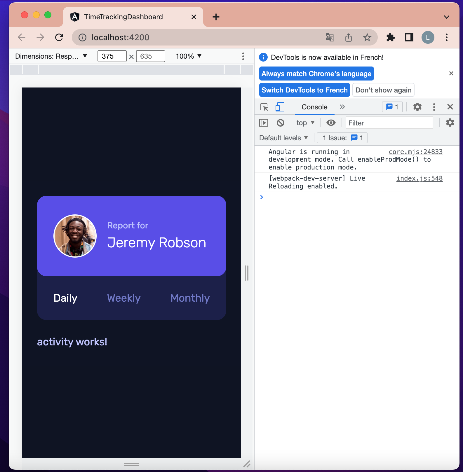 Figure 16: Activity component import
Next let’s break down the activity component into several blocks. The following image shows the decomposition of the activity component:
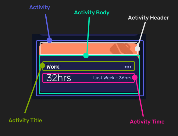 Figure 17: Activity component decomposition
Each activity component will receive data from the parent component. We will use the property binding concept to achieve that.
Open src/app/activity/activity.component.ts file and update its content to look like the following:
import { IActivity } from './activity.model';
import { Component, Input, OnInit } from '@angular/core';

@Component({
  selector: 'app-activity',
  templateUrl: './activity.component.html',
  styleUrls: ['./activity.component.scss']
})
export class ActivityComponent implements OnInit {

  // update
  @Input() activity!: IActivity;

  constructor() { }

  ngOnInit(): void {
  }

}
Now we can get an activity object from the parent. src/app/app.component.html should look like the following:
<!-- main container -->
<main
  class="grid grid-cols-1 gap-3 px-3 py-10">
  <!-- report component -->
  <app-report></app-report>

  <!-- activity component -->
  <app-activity [activity]="sampleActivity"></app-activity>
</main>
Update src/app/activity/activity.component.html to display the title of the activity received via property binding from the parent. src/app/activity/activity.component.html should look like the following:
<div>{{activity.title}}</div>
The following shows the application preview:
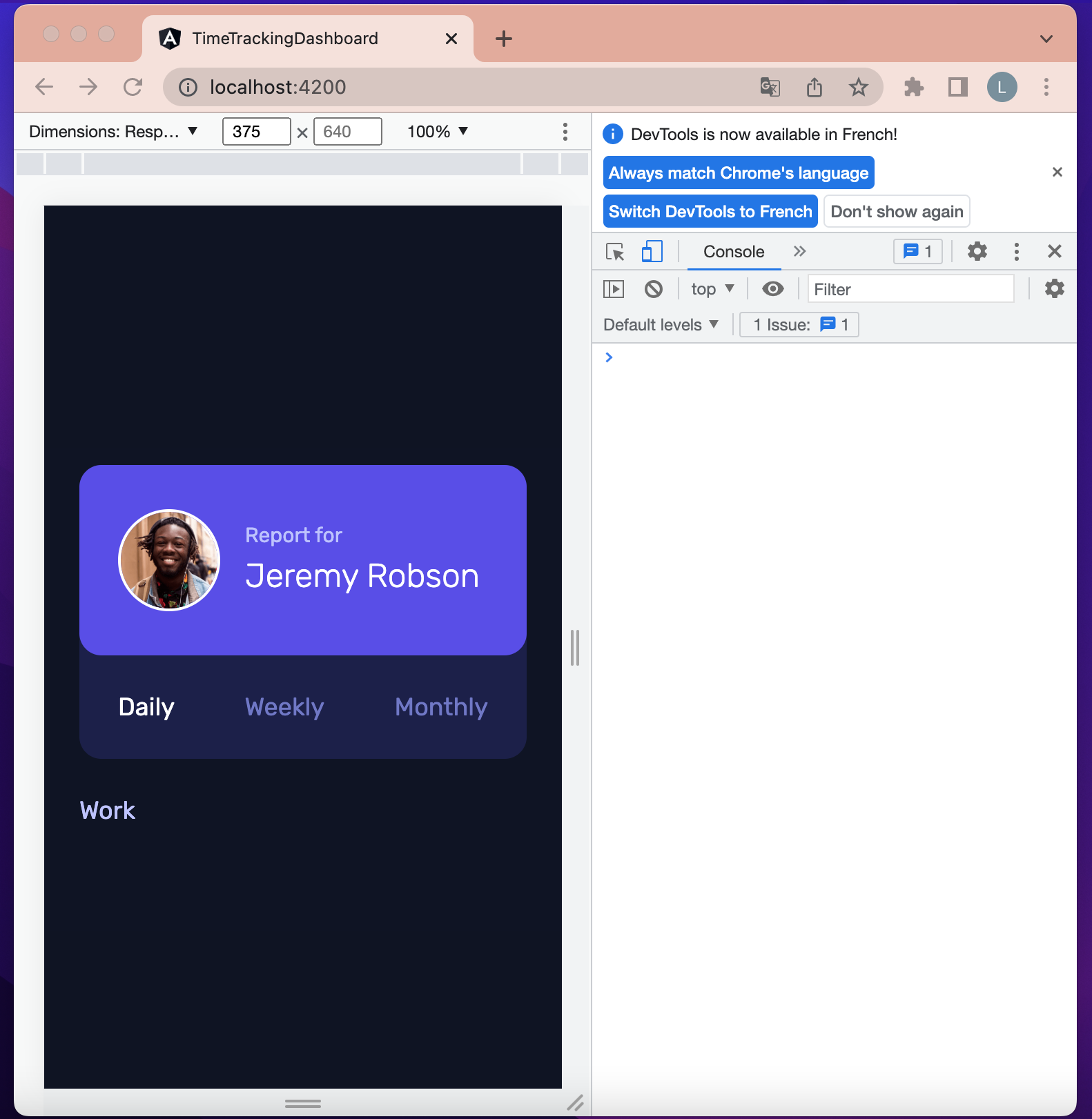 Figure 18: Activity component- Property binding test
Each activity component has a specific color and image so, update src/app/activity/activity.service.ts by adding two methods: one to get the image and another to get the color. src/app/activity/activity.service.ts should look now like the following:
import { IActivity } from './activity.model';
import { Injectable } from '@angular/core';
import { ACTIVITIES } from './mock-activities';

@Injectable({
  providedIn: 'root'
})
export class ActivityService {

  constructor() { }

  getActivities(): IActivity[] {
    return ACTIVITIES;
  }

  // update
  getImage(title: string): string {
    let url = "";

    switch(title) {
      case "Work":
        url = "/assets/images/icon-work.svg";
      break;
      case "Play":
        url = "/assets/images/icon-play.svg";
      break;
      case "Study":
        url = "/assets/images/icon-study.svg";
      break;
      case "Exercise":
        url = "/assets/images/icon-exercise.svg";
      break;
      case "Social":
        url = "/assets/images/icon-social.svg";
      break;
      case "Self Care":
        url = "/assets/images/icon-self-care.svg";
      break;
    }

    return url;
  }

  // update
  getColor(title: string): string {
    let color = "";

    switch(title) {
      case "Work":
        color = "bg-desaturated-red";
      break;
      case "Play":
        color = "bg-soft-blue";
      break;
      case "Study":
        color = "bg-light-red";
      break;
      case "Exercise":
        color = "bg-lime-green";
      break;
      case "Social":
        color = "bg-violet";
      break;
      case "Self Care":
        color = "bg-soft-orange";
      break;
    }

    return color;
  }

}
Now add methods in src/app/activity/activity.component.ts file that will call previously created methods. src/app/activity/activity.component.ts file content should look like the following:
import { ActivityService } from './activity.service';
import { IActivity } from './activity.model';
import { Component, Input, OnInit } from '@angular/core';

@Component({
  selector: 'app-activity',
  templateUrl: './activity.component.html',
  styleUrls: ['./activity.component.scss']
})
export class ActivityComponent implements OnInit {

  @Input() activity!: IActivity;

  // update
  constructor(private activityService: ActivityService) { }

  ngOnInit(): void {
  }

  // update
  getColor(title: string): string {
    return this.activityService.getColor(title);
  }

  // update
  getImage(title: string): string {
    return this.activityService.getImage(title);
  }

}
Activity and Activity Header blocks
Update src/app/activity/activity.component.html file content to be the same as the following:
<!-- Activity -->
<div [ngClass]="[getColor(activity.title), 'rounded-2xl', 'w-12']">

  <!-- Activity Header -->
  <div class="relative h-6 overflow-hidden">
    <img class="absolute -mt-1 right-3 w-8" [src]="getImage(activity.title)" [alt]="activity.title" />
  </div>
</div>
If we preview our application, we will have the following:
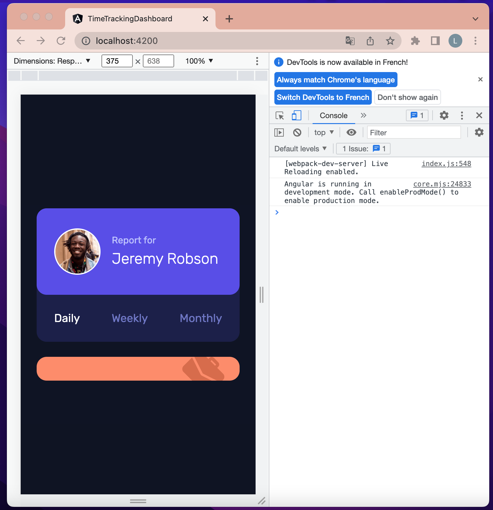 Figure 19: Activity component - Activity and header blocks
Activity body, Activity Title and Activity Time blocks
Update src/app/activity/activity.component.html file content to be the same as the following:
<!-- Activity -->
<div [ngClass]="[getColor(activity.title), 'rounded-2xl', 'w-12']">

  <!-- Activity Header -->
  <div class="relative h-6 overflow-hidden">
    <img class="absolute -mt-1 right-3 w-8" [src]="getImage(activity.title)" [alt]="activity.title" />
  </div>

  <!-- Activity Body -->
  <div class="px-3 py-4 bg-dark-blue rounded-2xl">

    <!-- Activity Title -->
    <div class="flex items-center justify-between">
      <h2 class="font-medium text-white">{{activity.title}}</h2>
      <div>
        <img src="/assets/images/icon-ellipsis.svg" alt="more" />
      </div>
    </div>

    <!-- Activity Time -->
    <div class="flex items-center justify-between">
      <span class="text-xl font-light text-white">{{activity.timeframes.weekly.current}}hrs</span>
      <span class="text-tiny">Last week - {{activity.timeframes.weekly.previous}}hrs</span>
    </div>
  </div>
</div>
Previewing the application should look like the following:
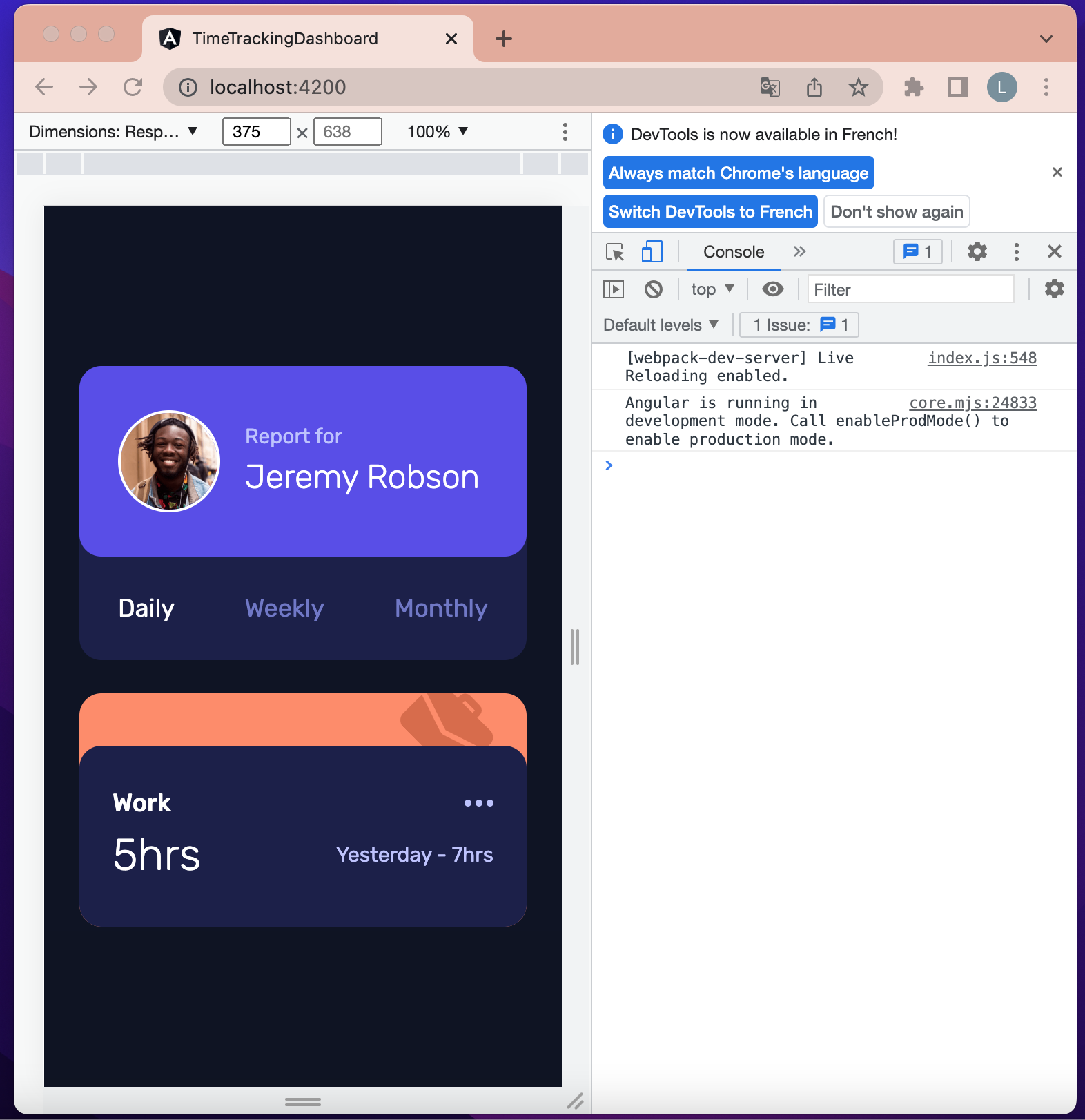 Figure 20: Activity component - body, header and title blocks
Now let’s synchronize the timeframe selected in report component with the activity components. To make the synchronization work, we will add a method in the report component that will send the selected timeframe to the parent component (the app component), then from the app component we will pass that timeframe to the activity component.
Open src/app/report/report.component.ts file and update its content to look like the following:
import { Component, EventEmitter, OnInit, Output } from '@angular/core';

@Component({
  selector: 'app-report',
  templateUrl: './report.component.html',
  styleUrls: ['./report.component.scss']
})
export class ReportComponent implements OnInit {

  // update
  @Output() changePeriod = new EventEmitter();

  periods: string[] = ["Daily", "Weekly", "Monthly"];
  activePeriod: string = "Daily";

  constructor() { }

  ngOnInit(): void {
  }

  setActivePeriod(period: string): void {
    this.activePeriod = period;

    // update
    this.changePeriod.emit(this.activePeriod);
  }

}
Open src/app/app.component.ts file and update its content to look like the following:
import { ActivityService } from './activity/activity.service';
import { IActivity } from './activity/activity.model';
import { Component, OnInit } from '@angular/core';

@Component({
  selector: 'app-root',
  templateUrl: './app.component.html',
  styleUrls: ['./app.component.scss']
})
export class AppComponent implements OnInit {
  activities: IActivity[] = [];
  sampleActivity!: IActivity;
  activePeriod = "Daily";  // update

  constructor(private activityService: ActivityService) {}

  ngOnInit(): void {
    this.activities = this.activityService.getActivities();
    this.sampleActivity = this.activities[0];
  }

  // update
  setActivePeriod(period: string): void {
    this.activePeriod = period;
  }

}
Open src/app/activity/activity.component.ts and update its content to look like the following:
import { ActivityService } from './activity.service';
import { IActivity } from './activity.model';
import { Component, Input, OnInit } from '@angular/core';

@Component({
  selector: 'app-activity',
  templateUrl: './activity.component.html',
  styleUrls: ['./activity.component.scss']
})
export class ActivityComponent implements OnInit {

  @Input() activity!: IActivity;
  @Input() period!: string; // update

  current: string = ""; // update
  previous: string = ""; // update

  constructor(private activityService: ActivityService) { }

  ngOnInit(): void {
  }

  // update
  ngOnChanges() {
    if(this.period === "Daily") {
      this.current = this.activity.timeframes.daily.current + "hrs";
      this.previous = "Yesterday - " + this.activity.timeframes.daily.previous + "hrs";
    }

     if(this.period === "Weekly") {
      this.current = this.activity.timeframes.weekly.current + "hrs";
      this.previous = "Last week - " + this.activity.timeframes.weekly.previous + "hrs";
    }

    if(this.period === "Monthly") {
      this.current = this.activity.timeframes.monthly.current + "hrs";
      this.previous = "Last month - " + this.activity.timeframes.monthly.previous + "hrs";
    }
  }

  getColor(title: string) {
    return this.activityService.getColor(title);
  }

  getImage(title: string): string {
    return this.activityService.getImage(title);
  }

}
Open src/app/activity/activity.component.html and update its content to look like the following:
<!-- Activity -->
<div [ngClass]="[getColor(activity.title), 'rounded-2xl', 'w-12']">

  <!-- Activity Header -->
  <div class="relative h-6 overflow-hidden">
    <img class="absolute -mt-1 right-3 w-8" [src]="getImage(activity.title)" [alt]="activity.title" />
  </div>

  <!-- Activity Body -->
  <div class="px-3 py-4 bg-dark-blue rounded-2xl">

    <!-- Activity Title -->
    <div class="flex items-center justify-between">
      <h2 class="font-medium text-white">{{activity.title}}</h2>
      <div>
        <img src="/assets/images/icon-ellipsis.svg" alt="more" />
      </div>
    </div>

    <!-- Activity Time -->
    <div class="flex items-center justify-between">
      <span class="text-xl font-light text-white">{{ current }}</span>
      <span class="text-tiny">{{ previous }}</span>
    </div>
  </div>
</div>
Finally open src/app/app.component.html and update its content to look like the following:
<!-- main container -->
<main
  class="grid grid-cols-1 gap-3 px-3 py-10">
  <!-- report component -->
  <app-report (changePeriod)="setActivePeriod($event)" ></app-report>

  <!-- activity component -->
  <app-activity [activity]="sampleActivity" [period]="activePeriod"></app-activity>
</main>
Now each time you select a timeframe on the report component display, the hours of the activity also change.
Now that our application works well for one single activity component, we will remove the sample activity we created before and then use the array of activities to display all of them.
Open src/app/app.component.ts and update its content to look like the following:
import { ActivityService } from './activity/activity.service';
import { IActivity } from './activity/activity.model';
import { Component, OnInit } from '@angular/core';

@Component({
  selector: 'app-root',
  templateUrl: './app.component.html',
  styleUrls: ['./app.component.scss']
})
export class AppComponent implements OnInit {
  activities: IActivity[] = [];
  activePeriod = "Daily";

  constructor(private activityService: ActivityService) {}

  ngOnInit(): void {
    this.activities = this.activityService.getActivities();
  }

  setActivePeriod(period: string): void {
    this.activePeriod = period;
  }

}
Open src/app/app.component.html and update its content to look like the following:
<!-- main container -->
<main
  class="grid grid-cols-1 gap-3 px-3 py-10">
  <!-- report component -->
  <app-report (changePeriod)="setActivePeriod($event)" ></app-report>

  <!-- activity component -->
  <app-activity *ngFor="let activity of activities" [activity]="activity" [period]="activePeriod"></app-activity>
</main>
Previewing the application should look like the following:
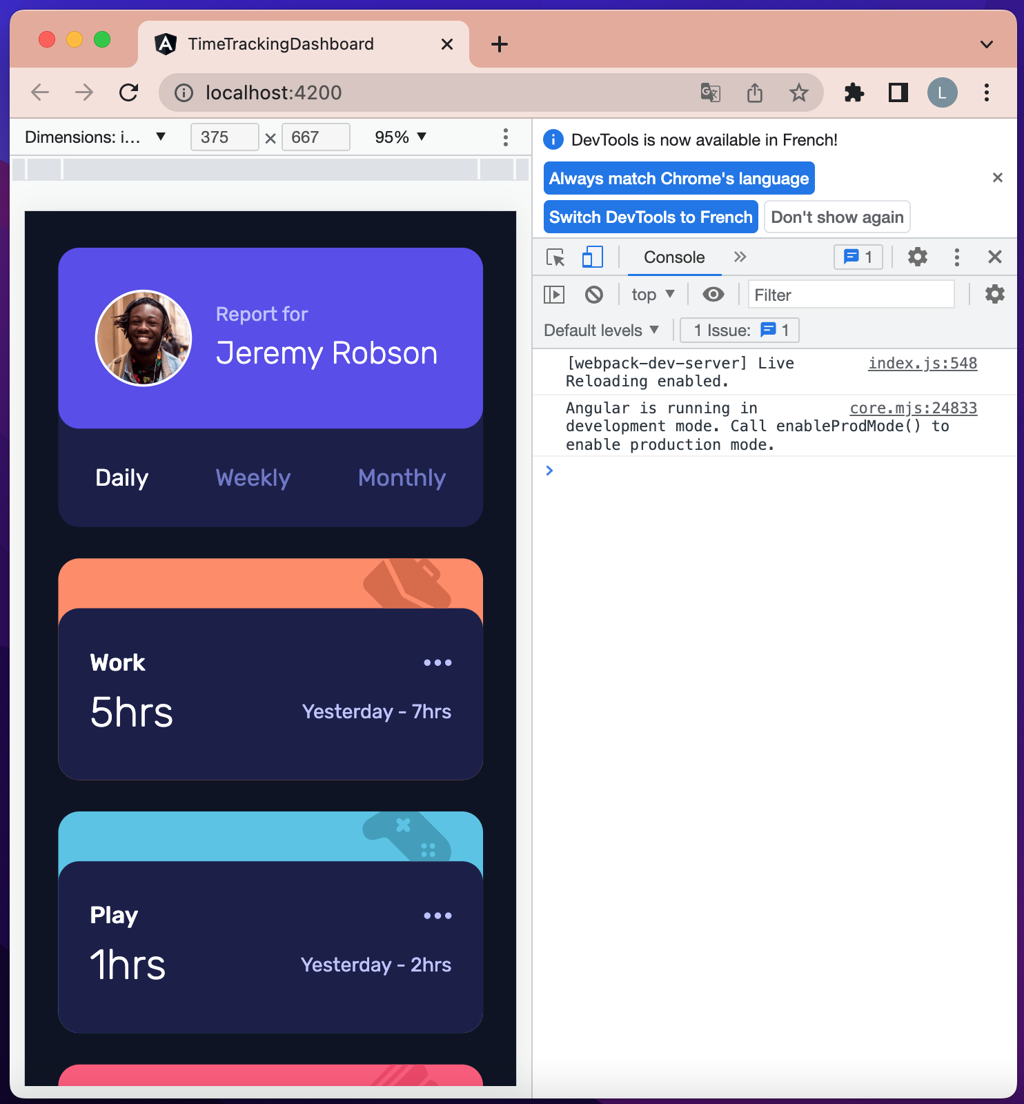 Figure 21: Activity components list
Desktop Design Implementation
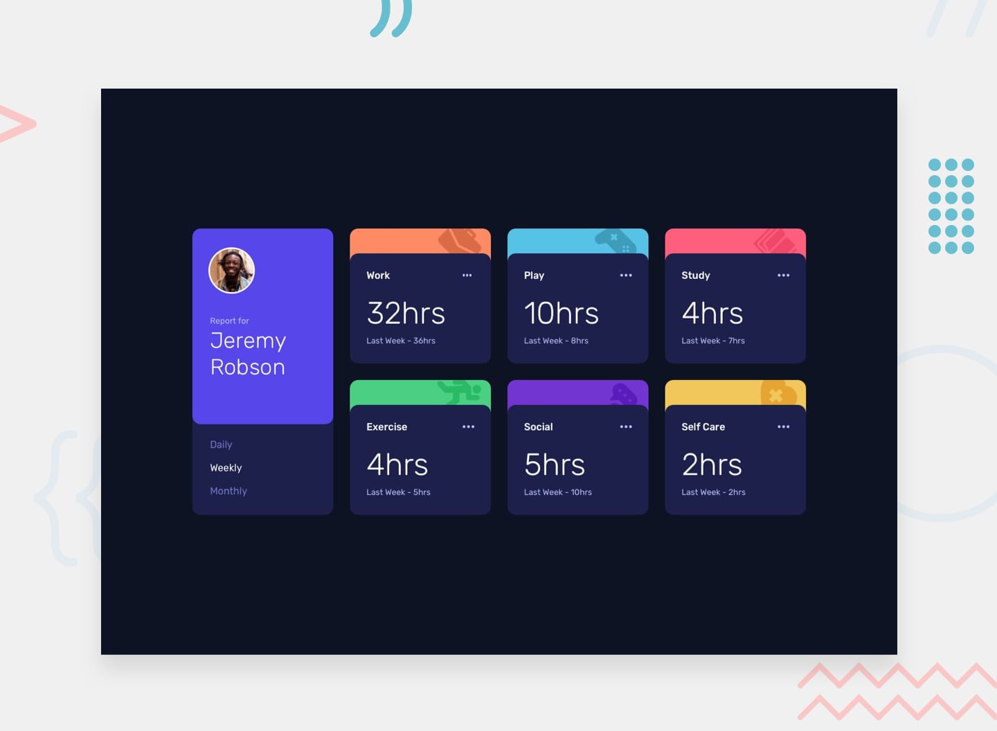 Figure 22: Time Tracking Dashboard desktop design
On desktop, the view changes from single column to multiple rows and columns. The breakpoint used for screen max-width is 1280px.
Open src/app/app.component.html file and update its content to look like the following:
<!-- main container -->
<main
  class="grid grid-cols-1 gap-3 px-3 py-10 xl:grid-cols-4 xl:grid-rows-2">
  <!-- report component -->
  <app-report class="xl:row-span-2" (changePeriod)="setActivePeriod($event)" ></app-report>

  <!-- activity component -->
  <app-activity *ngFor="let activity of activities" [activity]="activity" [period]="activePeriod"></app-activity>
</main>
If we preview the application on at list 1280px screen width, it should look like the following:
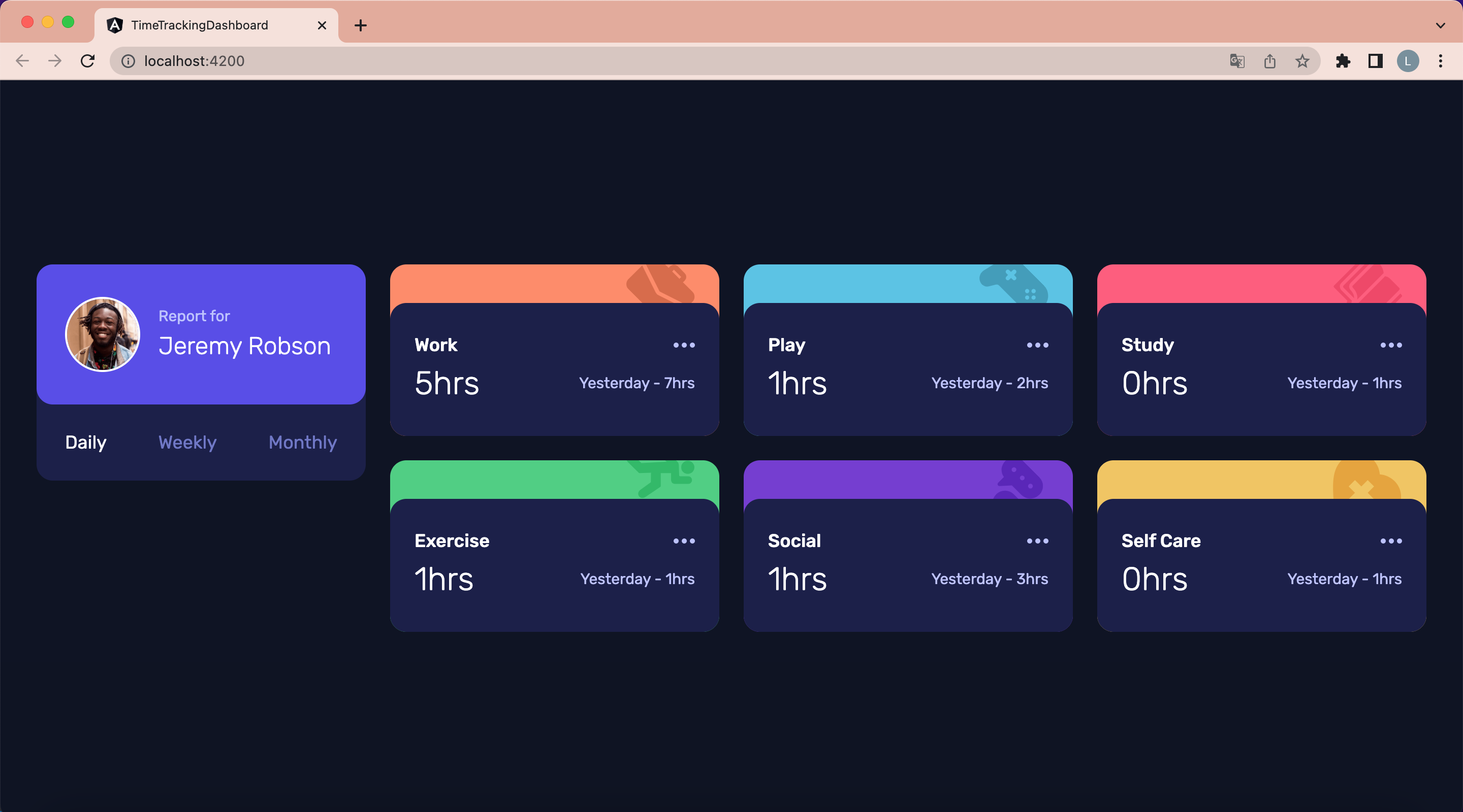 Figure 23: Preview on 1280px screen width
Open src/app/report/report.component.html file and update its content to look like the following:
<!-- Report -->
<div class="w-12 bg-dark-blue rounded-2xl xl:w-11 xl:h-full">

  <!-- Report Header -->
  <div class="flex items-center px-4 bg-blue py-5 rounded-2xl xl:flex-col xl:items-start xl:px-5 xl:h-2/3">

    <!-- Report Image -->
    <div class="mr-2 border-2 border-white rounded-full w-9 xl:mb-7">
      <img src="/assets/images/image-jeremy.png" alt="user profile picture" />
    </div>

    <!-- Report Title -->
    <h1 class="text-tiny">
      Report for <br>
      <span class="text-lg font-light text-white xl:text-2xl xl:leading-snug">
        Jeremy Robson
      </span>
    </h1>
  </div>

  <!-- Report Nav -->
  <div class="flex justify-between px-4 py-3 text-desaturated-blue xl:flex-col xl:px-5 xl:content-between xl:h-1/3 xl:w-fit">
    <span
      *ngFor="let period of periods"
      (click)="setActivePeriod(period)"
      [ngClass]="{
        'text-white': activePeriod === period,
        'xl:hover:text-white': true,
        'xl:cursor-pointer': true
      }"
    >{{ period }}</span>
  </div>
</div>
Then update src/app/activity/activity.component.html file content to look like the following:
<!-- Activity-->
<div [ngClass]="[getColor(activity.title), 'rounded-2xl', 'w-12', 'xl:w-11']">

  <!-- Activity Header -->
  <div class="relative h-6 overflow-hidden">
    <img class="absolute -mt-1 right-3 w-8" [src]="getImage(activity.title)" [alt]="activity.title" />
  </div>

  <!-- Activity Body -->
  <div class="px-3 py-4 bg-dark-blue rounded-2xl xl:p-5 xl:cursor-pointer xl:hover:bg-hover-blue">

    <!-- Activity Title -->
    <div class="flex items-center justify-between xl:mb-3">
      <h2 class="font-medium text-white">{{activity.title}}</h2>
      <div>
        <img src="/assets/images/icon-ellipsis.svg" alt="more" />
      </div>
    </div>

    <!-- Activity Time -->
    <div class="flex items-center justify-between xl:flex-col xl:items-start">
      <span class="text-xl font-light text-white xl:text-3xl">{{ current }}</span>
      <span class="text-tiny">{{ previous }}</span>
    </div>
  </div>
</div>
If we preview the application it should now look like the following:
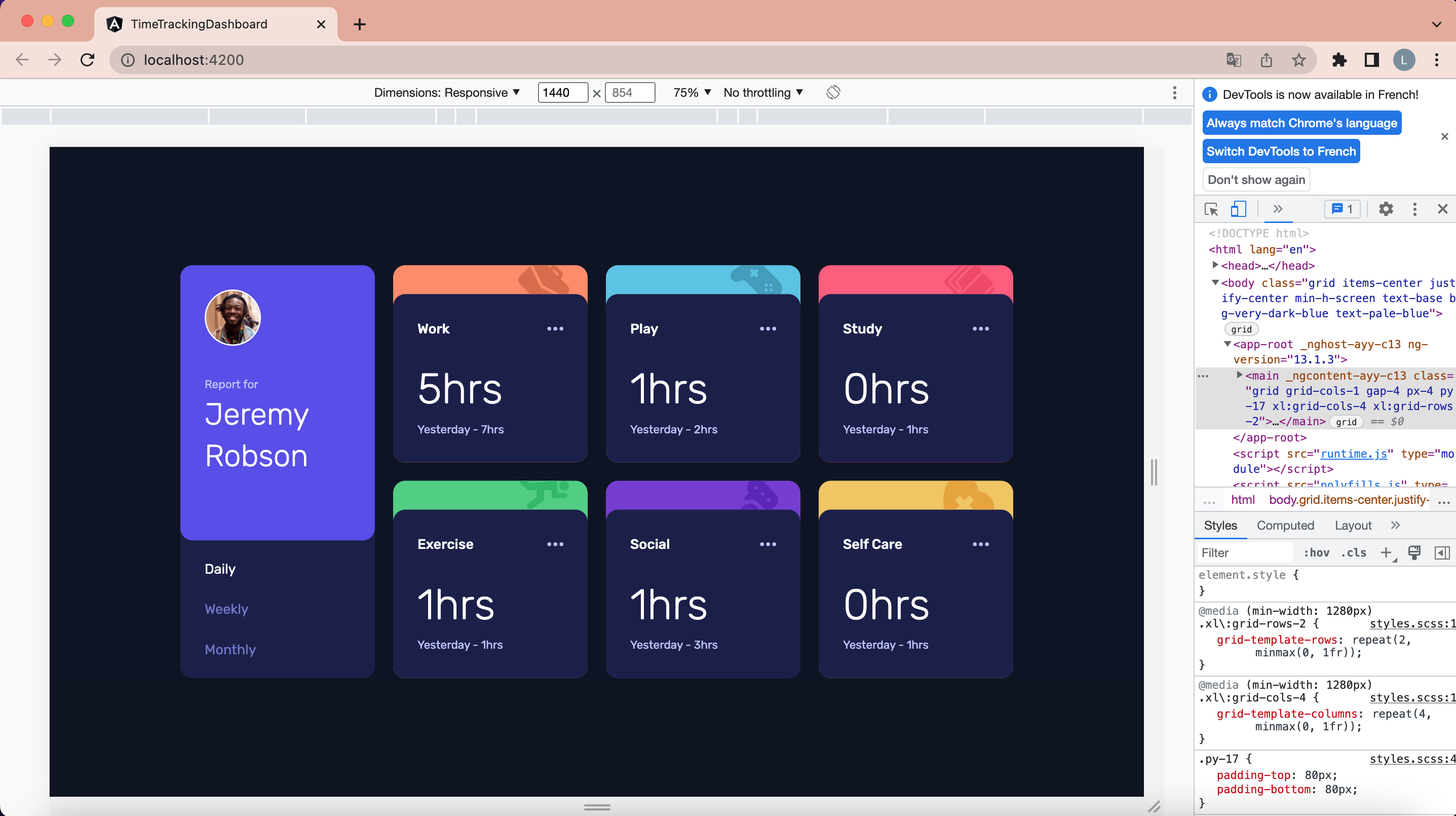 Figure 24: Responsive Time Tracking Dashboard
Now we have a responsive Time Tracking Dashboard built with Angular v13 and Tailwind CSS v3.
Project source code
You can download the project source code from Github at https://github.com/lioneltraore/frontendmentor.io-challenges/tree/main/Angular/time-tracking-dashboard
Live site
You can see the live site here